When studying an outbreak of an infectious disease, researchers often want to know who infected whom.
![]()
It is common to represent this in a diagram called a transmission tree, such as the one below.
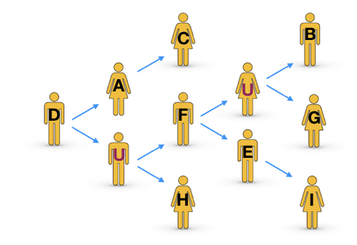
The arrows show who infected whom. Here person D was the source case and each person in our sample infected either 0, 1 or 2 people. There are two people labelled “U”. These are not people who we sampled but they are assumed to exist because timing and evolutionary distance imply that, for example, the strains which infected F and H descended from D, but these people were not directly infected by person D.
… is important
Usually we want to know “who infected whom” with the aim of answering general questions about the disease dynamics rather than pointing blame at specific individuals!1 For example, we might want to know:
- the number of people that each infectious person typically infects
- information about demography: whether the disease is being spread by a particular subset of the population e.g. children
- information about geography: whether people picked up their infection in a certain country, town or hospital, or were already infected when they arrived
- whether public health strategies (vaccinations, education, etc.) are helping
Building evidence to answer these sorts of questions can be really important for preventing future outbreaks, or at least reducing their size and impact. I will typically refer to the infected individuals as “people” for simplicity, but disease outbreaks in other organisms are studied in much the same ways.
… but difficult
Figuring out who infected whom is rarely a simple task. We can use genetic data (DNA / RNA / protein sequences etc.) and epidemiological data (times / locations / ages etc.). Even when there is lots of information it can be hard to infer the true history of the epidemic. Complicating factors include:
- the shear number of possible combinations
- “missing cases” - people who infected people in our sample, but were not themselves sampled
- the genetic data doesn’t always give a clear evolutionary signal (see homoplasy, recombination, difficulty in estimating the mutation rate etc.)
- variations in timings between being infected, becoming infectious and starting to show symptoms
- errors in data collection and processing.
With all these complications it is no surprise that sometimes our software fails to produce a confident theory of who infected whom. There are many software packages available, each of which handles the data differently and makes slightly different assumptions, typically producing different conclusions. Most of the techniques use a Bayesian approach which actually produces thousands of different possible transmission trees, each pretty much equally likely to be true. When there are lots of trees and/or the trees are large, it becomes very difficult to compare the scenarios by eye.
Our contribution: a way to compare transmission trees
In a previous blog post I explained how metrics can be used to compare complicated sets of objects. We developed a metric-based method to compare transmission trees. The full details can be found here:
Kendall, M., Ayabina, D., Xu, Y., Stimson, J. and Colijn, C. (2018) Estimating transmission from genetic and epidemiological data: a metric to compare transmission trees, Statistical Science, 33(1):70-85 [pdf]
It allows us to quickly and easily compare different transmission trees, enabling us to:
- discover outliers or clusters of similar trees
- summarise thousands of trees into a single representative tree (or one representative tree per cluster)
- compare how sensitive or robust our results are to changes in input data, methods and software
- check whether Bayesian inference methods have converged (have stopped coming up with any new suggestions) or whether they are still discovering new possibilities for the transmission tree.
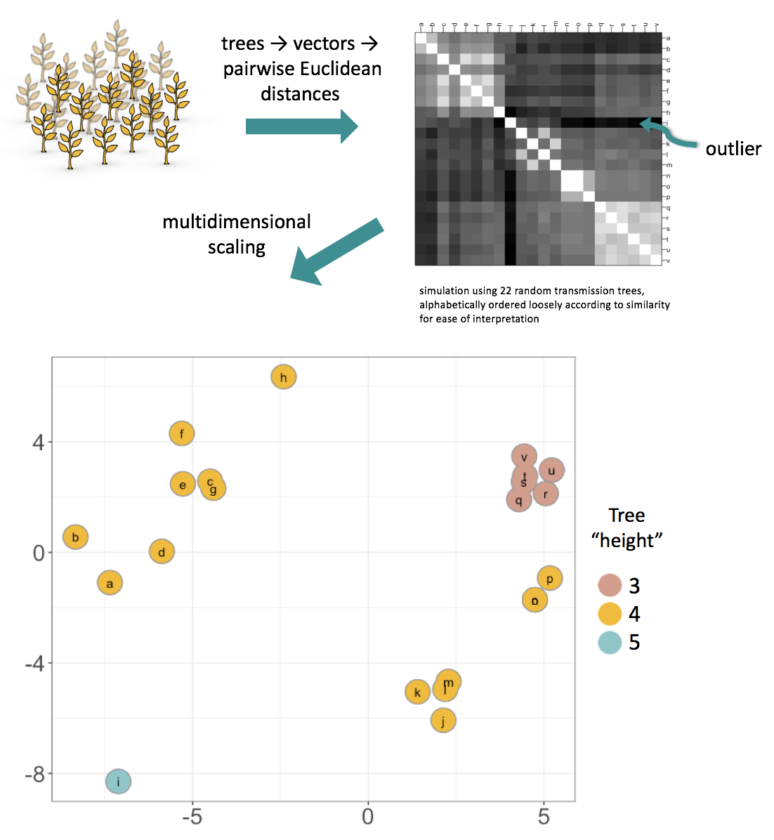
A brief overview of the maths: the method works by uniquely characterising each tree by a vector, then finding the Euclidean distance between each pair of vectors. The tree vector’s length is “the number of sampled cases choose 2”, and for each pair of cases the vector’s entry is the depth of the most recent common infector of those two cases. This captures features of historical transmission, particularly the source case, and information about the “shape” of the tree, which relates to R0. Outliers and clustering can be deduced from the pairwise distance matrix itself. In addition, multidimensional scaling can be used to visualise the space of trees, as in the example below. Typically the projection is “good” because we are using a Euclidean distance; this can be checked in each case, for example by a Shepard plot. In the example below, generated from 22 random trees, the multidimensional scaling plot preserves the clustering and outlier seen in the pairwise distance matrix. In addition, it can also be seen that the metric clearly separates trees by their “height” (maximum distance from the source case to a case with no onward infections).
The method is available in our R package treespace. If you would like to use it then this vignette is a good place to start.
1Added 15th January 2020: It is worth noting that as techniques improve, the potential increases for accurately identifying individual transmission cases, which raises important ethical questions about the potential harm which could be caused by such analyses - see this recent note in Clinical Infectious Diseases about identifying transmission networks in HIV studies.