Some of my research contributions in recent years have involved proposing new metrics. I thought it would be helpful to give a quick overview of what a metric is and why it can be useful.
What is a metric?
A metric is simply a “sensible” way of measuring distance. I’ll explain what I mean by that in a moment. In general, it is easy to come up with ways to measure distance but trickier to make sure that they’re “sensible”!
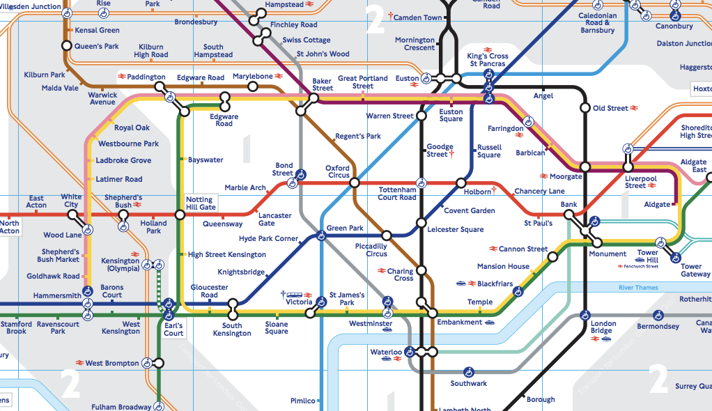
Let’s take the London underground network as an example. Suppose we wanted to have a way to describe the “distance” between two London underground stations. How would you do it?
Some ideas could be:
- the distance between two stations as given on the (highly stylised) map
- the direct distance in miles between two stations “as the crow flies”
- the actual distance in miles between two stations in terms of the train track
- the minimum number of stops you have to go through between the stations, perhaps with some “penalty” for every time you have to change lines
- the average time taken to get from one station to the other
- the difference in the number of letters in the names of the stations
… and there are many more options!
Although some options are more meaningful than others, each option is valid in its own way and would seem more or less sensible depending on who is trying to use the measure and why. For example, a typical commuter might be most interested in the average time; analysts concerned with wear and tear on the trains might be more interested in the miles of track traversed. So the idea of a “sensible” measure can very much depend on how the measure is being used.
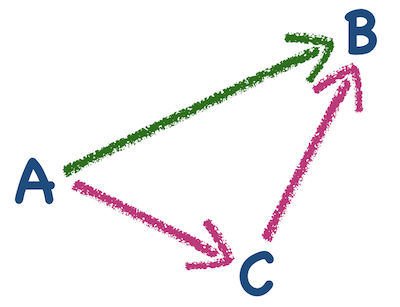
Mathematicians reserve the word metric for a distance like this which also satisfies four nice conditions. These ensure that the measure behaves intuitively. For a specified set of objects (e.g. stations) and a prospective distance measure, we can call the distance a metric if:
-
the distance between an object and itself is zero
-
the distance between one object and a different one should be bigger than zero, to show that they are different
-
the distance should be symmetric, so that the distance from A to B is the same as the distance from B to A
-
the distance from A to B should be as short as possible, so that there is never a situation where going from A to B via C is shorter than just going directly from A to B (known as the triangle inequality).
Although these four conditions are straightforward and seem very reasonable, we can see that for our tube map example some of our distance ideas would not be metrics. Even the “average time” idea - which seems very natural - may not always satisfy condition (3): it can take longer to change platforms in one direction than the other, and other peculiar quirks of the network give counter-intuitive timings.
Why are they useful?
Metrics can be applied to all kinds of things, not just physical places. It can be helpful to think of metrics not only as signals of distance - saying that objects are “nearby” or “far away” - but more broadly as signals of objects being “similar” or “different”. You could specify a metric on cars, for example, where you just count the number of aspects in which they differ: make and model, engine size, mpg, fuel type, colour and so on. That would be an effective way of scoring how “different” the cars are. If the metric gave two cars a score of zero you would know that they were the same type, and if it gave them a very big score you would know that they were very different.
Having a relevant metric becomes particularly useful when you have lots of objects to compare or the objects are very complicated. There are indeed millions of combinations of options for cars, especially if we include detail of all the extras: are we checking if they have the same seat fabric?! Once you have a good way of comparing many or complex objects, you have a way to start making sense of the variety amongst them. You can easily group similar objects together, and you can summarise a group by finding a representative or “average” one. A handy way to do this is by plotting a picture (technically called a multidimensional scaling plot). Although a little complicated to make by hand, these are very quick for a computer to make and really easy for us to interpret. The way they work is that each point represents one of the objects. When two points are close together it means they are similar according to the metric, and if they are far apart it means they’re very different.
The plot below is from some analysis we did about the evolution of woodmice. We used genetic sequence data for 15 woodmice and ran some analysis which produced 200 evolutionary trees, each giving a possible description of how they all evolved from a common ancestor. (Full details here.) We knew the trees weren’t all identical but we didn’t know how varied they were or whether there was much agreement between them.
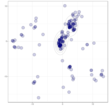
You can see from the overlapping points and the contour lines that most of the points are plotted in a similar place, indicating that many trees around there are really similar - they are pretty much in agreement about how the woodmice are evolutionarily related. However, we can also see that there’s not complete agreement: there are two slightly distinct clusters of points in the middle, and various “outlier” points dotted around the outside.
Without a metric it would have been almost impossible to go through hundreds (often it can be thousands) of possible trees checking where they agree and where they differ. With a metric, we were able to let a computer very quickly sort through all the trees and produce this plot to organise our data. Hopefully this provides a taste of how and why metrics can be so very powerful and helpful when dealing with big or complicated sets of information.