A “national reproduction number” R becomes trickier to estimate and to interpret as case numbers decrease. This post began life as a twitter thread. I thought it might be useful to keep a copy here for easy reference.
There will be stories in the coming days (I’m writing this in mid-March 2021) of how the UK R rate is “creeping up”. This information is
a) almost certainly true
b) hard to interpret
c) probably not as scary as it sounds.
Let me explain.
First, a quick note: I’m talking purely from cases data found on the government dashboard. Other measures and leading indicators are available.
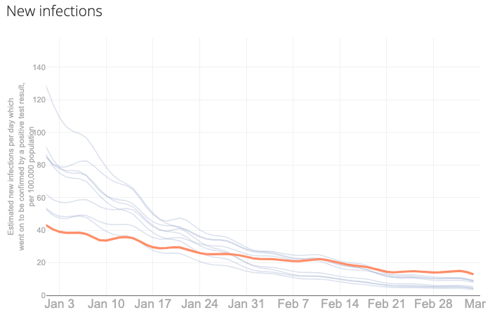
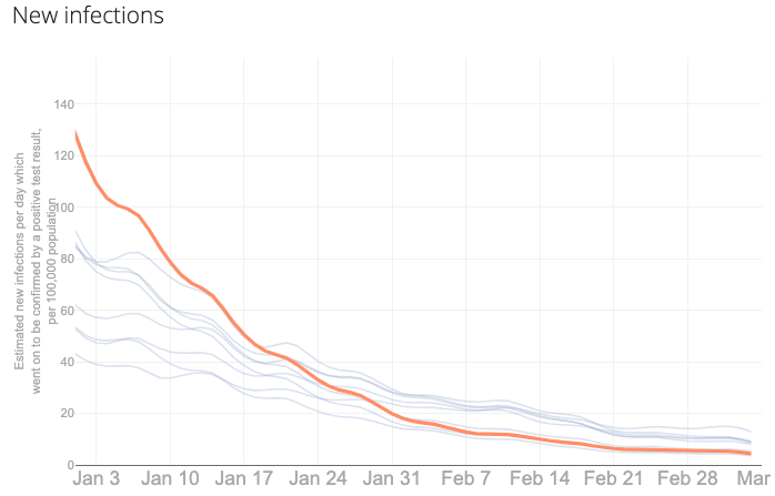
Daily numbers of new infections have been going down nicely since January, though at different rates across regions. For example, here I’m showing the nine regions of England and highlighting Yorkshire and the Humber (left) and London (right).
Correspondingly, they have experienced different R rates, though importantly they’ve both been below one throughout 2021 so far. Long may that continue. (Again, Yorkshire and the Humber on the left, London on the right.)
_Y&H.png)
_London.png)
As case numbers decrease, R becomes more tricksy. It’s a trade I’m happy to take! I’d argue it becomes less meaningful to speak of a “national R rate” because little surges which would once have been lost in the noise now start to have more impact on the overall picture.
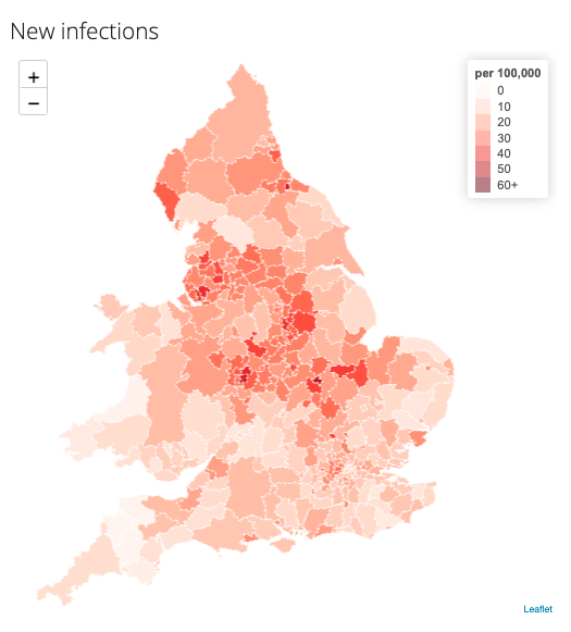
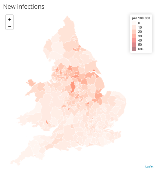
There is a lot of geographical variation, and more so recently. For example, here are estimates of R for 1st February (left) and 1st March (right) for England and Wales.
_Feb.png)
_March.png)
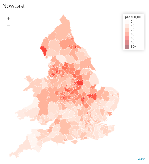
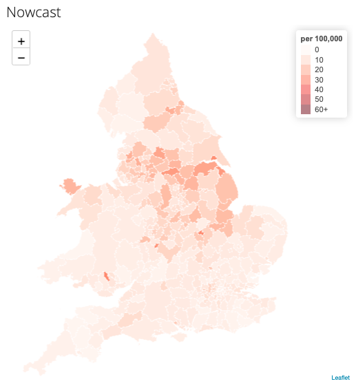
But the picture for new infections per day per 100,000 is much more hopeful. (Again, 1st February on the left, 1st March on the right)
As case numbers come down, I find it is easier to interpret a measure that combines R and infection numbers.
Maybe not this one.
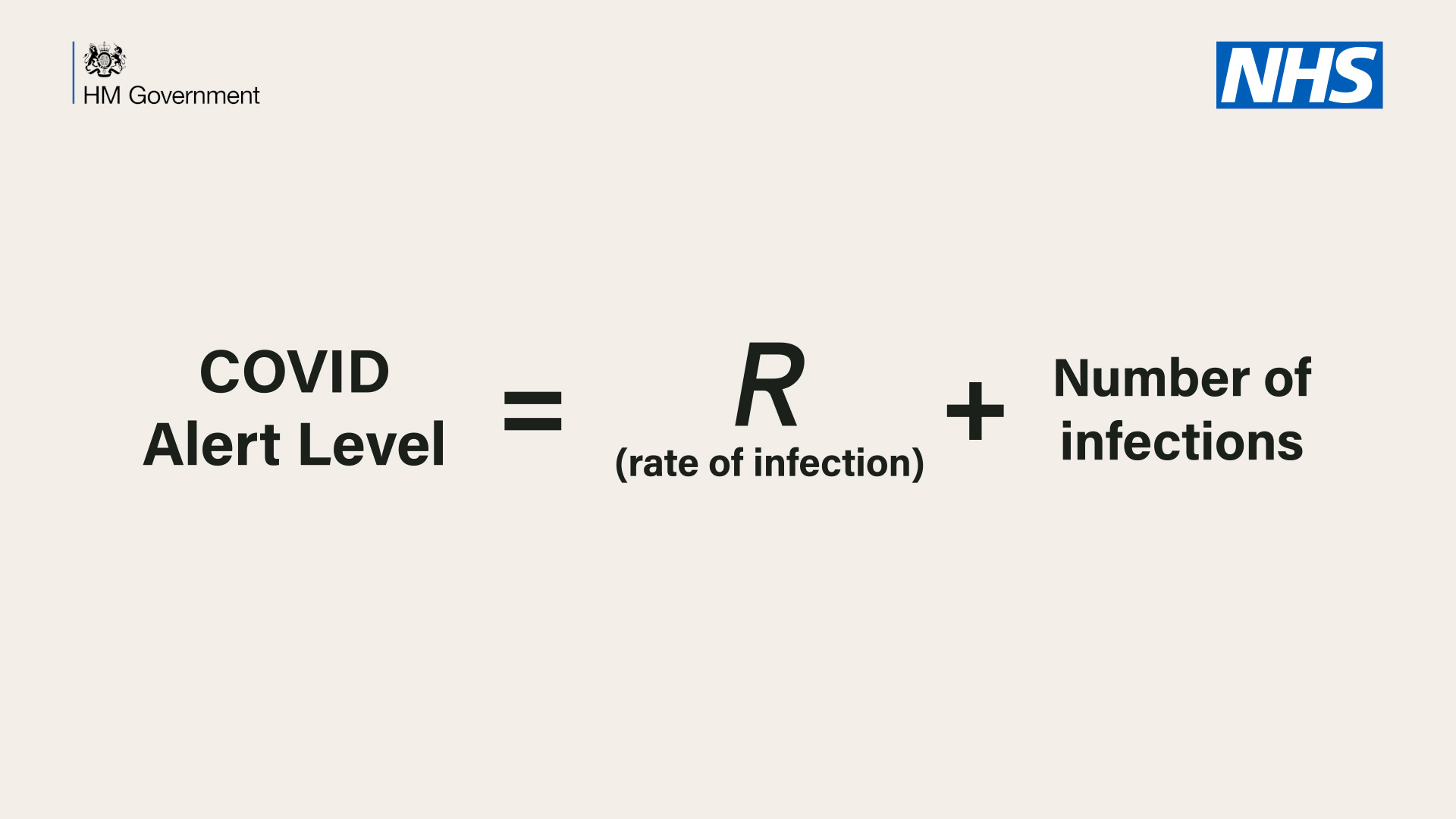
But you might like our nowcast measure, which essentially replaces that “+” with a “x” and averages over a week at a time, on a rolling basis. Then, once again, March looks much better than February. Phew.
There is also more variation by age now, so that “R for England” might be more usefully separated into “R for each age bracket”. For example, here’s cases by reporting day for England for 10-14 year-olds (yellow), 25-29s (orange) and 90+ (blue) which have seen a surge, a plateau and a decrease, respectively, in the last two weeks.
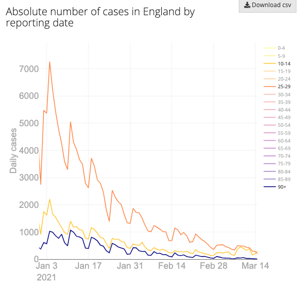
The lower the overall national case numbers, the more any surges will show up in the national estimate. Which is fine, but I think it makes it increasingly difficult to interpret a “national R number” and increasingly helpful to break it down by geographies and ages.
To explore any of these trends in more detail, and to find references and open-source code, see our shiny app LocalCovidTracker (which works better on desktops than mobiles).